Introduction
Have you ever walked into a room and instantly felt calm, energetic, or even hungry? It’s not just about the decor or the lighting—it could be the color of the walls that’s affecting your mood. Color psychology is a fascinating field that studies how color influences human behavior and emotions. By understanding the effects of different colors, you can make informed choices when it comes to painting your home, creating spaces that not only look great but also feel great. Let’s dive into the world of color and discover how to use it to your advantage.

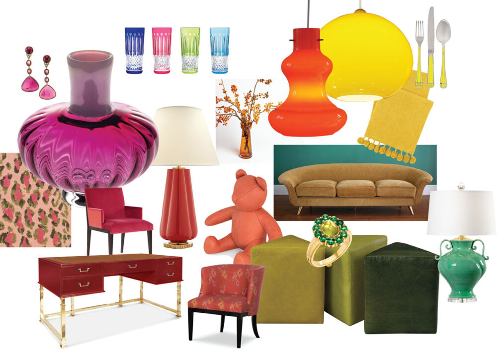
The Power of Color
I remember entering my grandmother’s kitchen as a child; the soft yellow walls seemed to wrap around me like a warm hug. That’s the power of color—it can evoke memories, emotions, and even influence our behavior. Research shows that certain colors can stimulate your appetite, help you relax, or make you feel more alert. Knowing this, choosing the right paint color for each room can enhance your daily life.
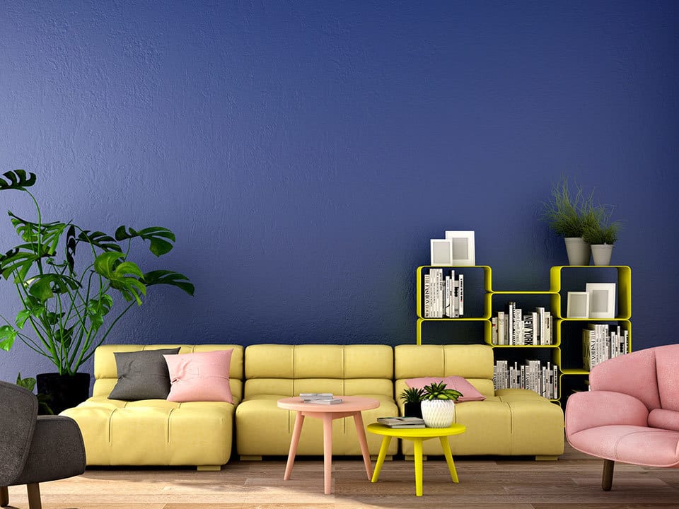
Living Room: A Hub of Energy and Relaxation
The living room is where life happens. It’s a place for relaxation, socializing, and entertainment. To strike the perfect balance, consider a soft blue or green. These colors are known for their calming effects, promoting peace and tranquility. They can also facilitate communication, making them ideal for a space that often buzzes with conversation.
Kitchen: Appetite and Energy
The kitchen is the heart of the home, a place for culinary creativity and gathering. Warm tones like reds and oranges are known to stimulate the appetite, making them a popular choice. However, if you’re aiming for a more soothing environment to counteract the busy nature of the kitchen, a crisp white or a gentle gray can create a clean and calming space.
Bedroom: Rest and Rejuvenation
Your bedroom is your sanctuary, a place for rest and rejuvenation. Cool, muted colors like lavender, light blue, or even a soft, earthy green can create a serene atmosphere conducive to relaxation and sleep. Personal experience has taught me that a cluttered color scheme can lead to a cluttered mind, so I opt for simplicity and harmony in bedroom hues.
Bathroom: Clean and Refreshing
For many, the bathroom is a spa-like retreat. Light blues, greens, and turquoises can turn this space into a refreshing oasis. These colors evoke cleanliness and can give the feeling of a natural spring or a gentle sea breeze.
Home Office: Focus and Productivity
In a home office, the goal is to boost focus and productivity. Shades of blue can stimulate the mind, while earthy tones like green can help reduce anxiety and promote concentration. Avoid overly vibrant colors that might distract you from your work.
Practical Tips for Choosing Paint
- Test before you paint: Invest in sample pots and paint large swatches on the walls to see how the color behaves in different lighting conditions throughout the day.
- Consider lighting: Natural and artificial lighting will affect how a color looks. LEDs, for example, tend to bring out blues and greens, while incandescent bulbs warm up reds and yellows.
- Don’t forget the finish: The sheen of the paint can also affect the color perception. Matte finishes can soften a color, while glossier finishes make it pop.

Engaging with the Audience
Now, I’d love to hear from you! What are your experiences with color in your home? Have you noticed a change in mood with different paint colors? Share your stories in the comments below, and let’s start a colorful conversation!
Color has the power to transform not just a room, but the people within it. By choosing the right shades for your walls, you can create a home that’s not only a visual delight but also an emotional sanctuary. So, grab that paintbrush and let the colors do the talking!
Leave a Reply